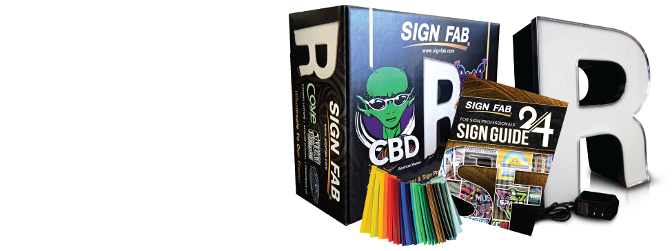
When it comes to signage, a unique, high-quality, high-contrast font is one of the most important factors to remember. We have managed to put fonts into three categories to make this and our quoting process easier for our customers. We have divided the categories into block, serif and script. If you are unsure about the category of the sign, feel free to call us at 800-544-6381 and talk to a sales representative.
When designing a sign, one of the very first choices to decide upon, is the font. The font will be determined by the audience that is trying to be reached. Though it might seem minor, the choice of font matters greatly. The right font will enable your customer to quickly discern your message; the wrong font may keep him from reading your sign at all.
To determine the right font for your needs, you’ll want to know a little about each one.
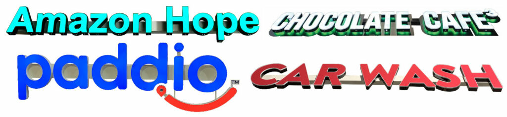
Block Fonts
Block fonts have strokes that are the same thickness. Strokes are the main lines and curves that form the shape of the letter. Block fonts almost always have squared-off corners on the edges. This doesn’t mean there won’t be any curves. A letter “S” or “O” is hard to make without any curves, though some fonts achieve this. But block fonts are more likely to have lots of straight lines and sharp corners than other fonts.
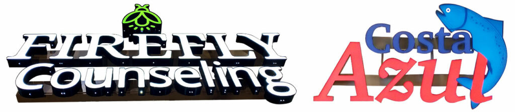
Serif Fonts
A serif is the small, angled line projecting from the upper and lower ends of the letter. The most popular serif typeface is Times New Roman, which was created in 1931 for the British newspaper The Times. Serif fonts are the easiest to read, especially when dealing with large amounts of text.
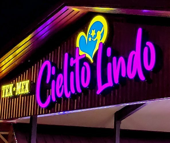
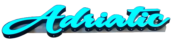
Script Fonts
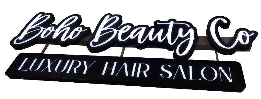
Script fonts are stylish and formal. These fonts are designed to mirror handwriting but can be difficult to read unless designed well. This font should be used with care on signage.
All these fonts have certain characteristics that are great for certain sign types but determining which fonts to use can have a huge impact on the legibility and readability of your sign. Legibility concerns the fine details of typeface design. This means the ability to recognize individual letters or words. Readability concerns the arrangement and layout of the text as a whole. An illegible type cannot be made readable and even the most legible of types can be made unreadable.
Letter Sizes & Stroke Width
Another factor is letter size and stroke width. While it’s tempting to use any and every font you like, your customer will appreciate a clearer message. We suggest using three or less fonts when laying out any graphic. It’s simple and fast and delivers your message clearly.
Manufacturing Limitations
The height and thickness of letters play an important role in how we manufacture letters. The smallest size we manufacture is 7” high for any font except serif, serif fonts are fabricated at 12” high. Another limitation is price, smaller letters may be more labor-intensive because they are more difficult and time consuming to fabricate.
Stroke width is also important. Make sure strokes are at least 1.5” wide to accommodate LEDs and fabrication. Even if the sign is non-illuminated the stroke must be 1.5” wide because of fabrication time. If the font specifies a small stroke, we will adjust the artwork and submit it back for approval.
Considerations
When first beginning to design, think carefully about who will see your sign. Will they be reading a large amount of text, or standing in line at the cash register, reading your return policy? Will they be driving past your business, reading your sign while speeding along at 60 mph? For a sign visibility chart click here.
Choosing the right font for your needs ensures that you message will be read and your sign is effective. If you have questions about fonts or what category our signs fall in just give us a call at 800-544-6381.