Since they work together to draw clients, using the appropriate color for your sign will have a significant impact on your company. Why? We are conditioned to see contrasts. Understanding color meanings in business is crucial when creating a sign for your company because color has a strong subconscious impact on every aspect of our lives. Although we rarely consider the effects of the colors we choose, this can be a very useful tool to help us choose the best colors.
Although there are numerous factors that contribute to the effectiveness of your signs, color and contrast are closely related to their effectiveness:
- Select a dark background with light or a light background with dark lettering.
- Your sign will be more effective, if when using multiple colors, they are limited to one space or used in the lettering.
Here is what the main colors mean for your sign and for your business.
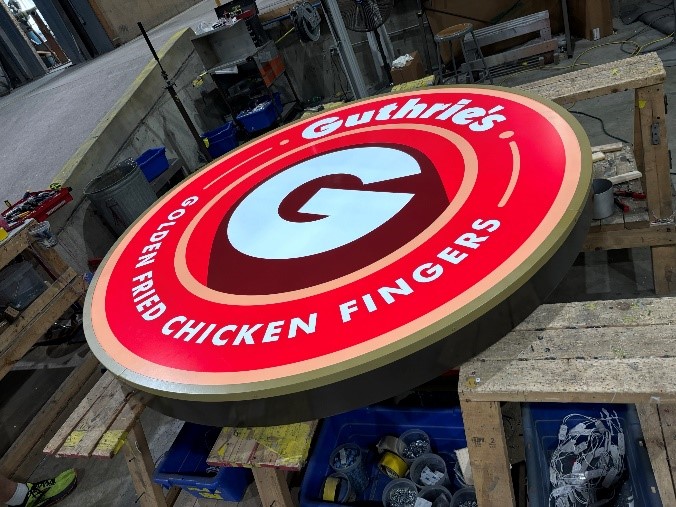
Design Using Red
Red is the most daring color there is! Companies in industries like restaurants, technology, automobiles, and retail use this color to pique customers’ interest in making an immediate purchase, particularly when a sale isn’t going to last long.
• Kind, assertive, and self-assured
• Power and action
• Desire, passion
• Bravery, strength, and attention-grabbing

Design Using Orange
Orange is a color that connotes optimism, fun, and adventure. It boosts sales in bistros, cafes, restaurants, and diners by promoting conversation and appetite, which causes customers to stay longer and spend more money.
• Kind, amiable, and casual
• Exciting, daring, adventurous
• Sensational
• Reasonably priced
• Friendly, outgoing, and hopeful
• Creative flair

Design Using Yellow
Yellow can be challenging. It can be cheerful and whimsical, elicit sentiments of optimism and clarity, and be warm and welcoming. This color can be bright and cheerful, professional and serious, or it can be used as a call to action or starburst to encourage customers to have fun.
• Sharing of novel concepts
• Confidence, uniqueness, and creativity
• Optimism, uplifting, and illumination
• Joy, playfulness, and enjoyment

Design Using Green
Create Anything involving money, health and healing, financial businesses, or situations where you need people to see both sides of an issue can benefit from using Green because it promotes clear thinking and decision-making.
• Growth and vitality, rejuvenation and restoration
• A love of nature and a focus on family
• Empathy, compassion, and nurturing
• Flexibility and adaptability
• Encouragement of “social joining” of clubs and other groups out of a sense of belonging

Design Using Blue
The color blue conjures up feelings of dependability, trust, serenity, and dependability. Blue signage builds a relationship of trust with your clients.
• Robustness, vitality, and morale-boosting
• Loyalty, trust, and integrity
• Dependability and accountability
• Conservatism and tenacity
• Authority, devotion, and reflection
• Tranquility and serenity

Design Using Purple
When used on signage, purple connotes luxury, intelligence, and inventiveness. Additionally, it can arouse sentimentality and is effective for companies that sell unique products.
• Mystery, fantasy, and the future
• Distinctive, unique, imaginative, and creative
• Royalty, luxury, education, and elegance

Design Using Gold
Businesses that market goods with a high perceived value will profit from using gold. Gold conveys a sense of quality, wealth, and prestige when paired with dark red, dark blue, or dark green.
• Luxury, high cost, and extravagance
• Prosperity and wealth
• Abundance
• Value and quality

Design Using Silver
Silver is a symbol of fine craftsmanship and artistry and would be advantageous to companies that provide top-notch services or goods or sell luxury goods to high-end consumers. suitable for scientific and technical businesses as well as the high-tech, cutting-edge computer market.
• Chic and fashionable
• Sleek, contemporary, high-tech, scientific
• Imagination and illusion
• Wealth and riches

Design Using Black
Black is regarded as innovative and fashionable. When paired with vivid, rich jewel-like hues like orange, yellow, magenta, cobalt, emerald, and red, it can produce a dramatic effect. Use black sparingly because too much of it can be unwelcoming and suggestive.
• Alluring, enigmatic
• Control, authority, and power
• Firm, contained, and official

Design Using White
The best color to use for signs’ backgrounds is white. With the exception of pastels and yellow, it makes all other colors highly readable and permits all other colors to reflect off of it. It is the color of innocence, cleanliness, clarity, and purity. This color is used by businesses to promote sanitation, hygiene, and health.
• Pristineness, and openness
• Cleanliness
• Purity, simplicity, neatness
• Innocence, self-sufficiency

Design Using Gray
Gray is appropriate for implying authority and control in legal and financial enterprises. It can be combined with nearly any other color to convey a different message and reach different target markets because it is neutral and serious.
• Modern and neutral
• Intelligence, knowledge, wisdom, and security
• Longevity and classy
• Sophistication, professionalism, and maturity
• Refinement, dignity, and conservatism

Design Using Brown
Brown is appropriate for companies that market outdoor goods and services because it is associated with the outdoors and practical pursuits. The use of brown conveys positive messages of homeliness and comfort, durability, and credibility. Brown is also linked to neatness, openness, approachability, and friendliness.
• Wholesome, natural, and organic
• Sturdy, stable, practical, earthy, and down-to-earth
• Cozy, and warm
Just keep in mind that for your signage to stand out, color and contrast work best together! Combining color and contrast has a greater impact than using a lot of different colors, which can overpower your sign and make it difficult to understand what you’re trying to say. By following these tips, you can create a personalized sign that will be vivid and noticeable. Give us a call at 800-544-6381 with any questions, and we’ll be happy to point you in the right direction!
For more tips on colors visit our YouTube Channel!
