Using the right color on your sign will have a huge impact for your business as they go hand in hand to attract customers. Why? Our eyes are trained to look for contrasts. Color has a powerful subconscious effect on every part of our lives and understanding color meanings in business is essential when you are establishing a sign for your business. We don’t often realize the impact of our color choices but this can be an invaluable tool to get the best color choices as possible.
There are many factors that make your sign effective but color and contrast go hand in hand with the effectiveness of your signs:
- Choose either a light background with dark lettering or a dark background with light lettering.
- Your sign will be more effective, if when using multiple colors, they are limited to one space or used in the lettering.
Here is what the main colors mean for your sign and for your business.

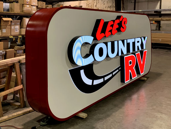
Design Using Red
You can’t get much more bold than red! Businesses such as restaurants, technology, cars and retail use this color to draw on customers sense of urgency to buy right away, especially if a sale isn’t lasting long.
- Action, power
- Passion, desire,
- Strength, courage
- Attention-getting
- Warm, assertive and confident
Design Using Orange
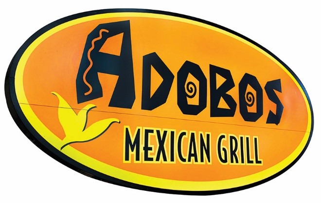
Orange can be used to suggest adventure, fun and optimism. It encourages sales in restaurants, cafes, bistros and diners as it stimulates appetite and conversation making patrons sit longer and spending more money.
- Adventurous, risk-taking, vibrant
- Stimulation to the senses
- Affordable
- Warm, sociable, optimistic
- Creative flair
- Warm-hearted, agreeable and informal

Design Using Yellow
Yellow can be complicated. It can be warm and inviting, evoke feelings of optimism and clarity and bright and whimsical. This color can range from serious and professional to bright, to optimistic and encourages customers to have fun and is great to have as a starburst or call to action.
- Cheerful, happy, playful, fun
- Optimistic, uplifting, illuminating
- Confidence, originality, creativity
- Communication of new ideas

Design Using Green
Green is beneficial for anything to do with health and healing, money, financial businesses and where you need people to see both sides of a situation as it aids in clear thinking and decision making.
- Growth and vitality, renewal and restoration
- Nature lover and family oriented
- Sympathetic, compassionate and nurturing
- Adaptable and flexible
- Encourages “Social Joining” of clubs and other groups, a need to belong

Design Using Blue
Blue is a color that evokes the feeling of calmness, reliability and a sense of dependency and trust. Blue signage creates a trusting relationship between you and your customers.
- Loyalty, trust and integrity
- Reliability and responsibility
- Conservatism and perseverance
- Authority, devotion and contemplation
- Peace and calm
- Energetic, vibrant, morale booster

Design Using Purple
Purple used on signage suggests creativity, wisdom and luxury. It can also evoke nostalgia and works well for businesses that have rare items.
- Unusual and individual
- Creative and inventive
- Mystery, fantasy and the future
- Royalty, luxury,
- Education and elegance

Design Using Gold
Business marketing items of high perceived value will benefit from the use of gold. Gold combined with dark red, dark blue or dark green imparts a message of quality, wealth and prestige.
- Wealth and prosperity
- Abundance
- Value, quality
- Luxury, expensive, opulence
Design Using Silver
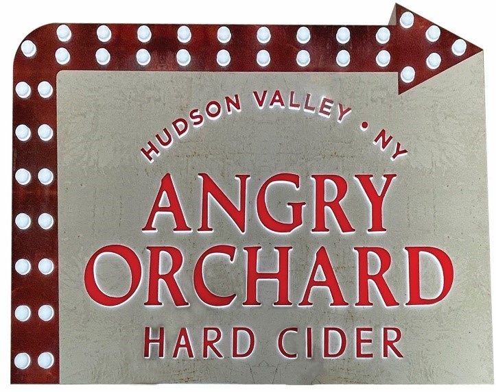
Silver reflects quality craftsmanship and artistry and would benefit businesses offering a first-class quality service or product or those selling exquisite items to the prestige market. Appropriate for the hi-tech, innovative computer market and scientific and technological companies.
- Modern, sleek, high-tech, scientific
- Illusion, imagination
- Sophisticated
- Wealth and riches
- Chic, stylish

Design Using Black
Using Black is seen as cutting edge and trendy. It can be used to create dramatic effect with combined with bright, rich, jewel colors such as red, emerald, cobalt, yellow magenta and orange. Using too much black can be intimating and unfriendly, so use wisely.
- Authority, power, control
- Strong, contained, formal
- Seductive, mysterious
Design Using White
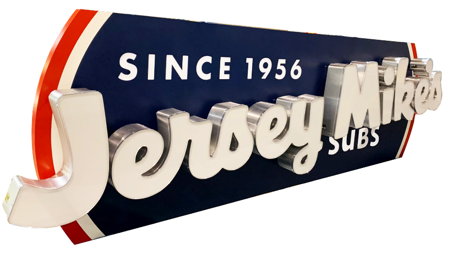
White is the best colors to use as the background color for signs. It allows all other colors to reflect from it and makes all colors except yellow and pastels to be very readable. It is the color of purity, innocence, clarity and cleanliness. Companies trying to convey health and hygiene and sanitation use this color.
- Innocence
- Purity, cleanliness
- Simplicity
- Immaculate and neat
- Self-sufficient, pristine and open
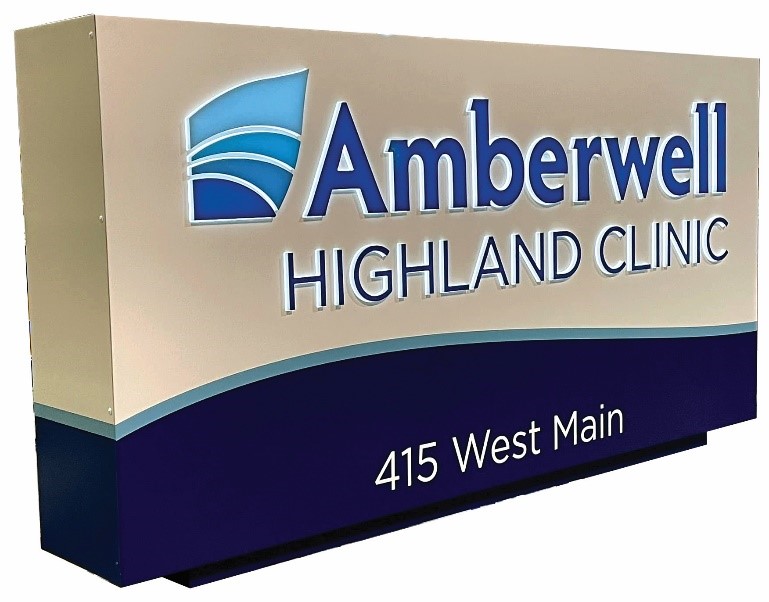
Design Using Gray
Gray is suitable for legal and financial businesses to suggest power and control. It is neutral and serious and can be combined with almost any other color to impart different message and to reach different target markets.
- Intellect, knowledge, wisdom, security
- Perceived as long-lasting, and classic
- Sleek, professional, mature
- Refined, dignified, conservative
- Neutral, contemporary
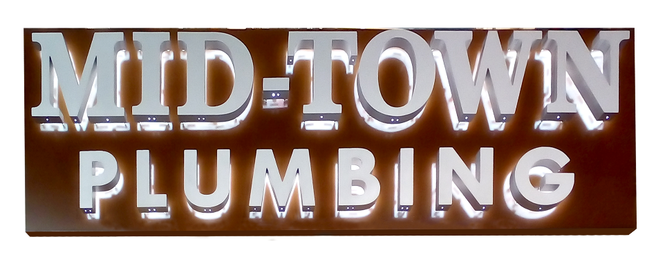
Design Using Brown
Brown is connected to the outdoors and down to earth activities and is suitable for businesses promoting outdoor products and services. Durability and credibility as well as homely and comfortable are positive messages given by the use of brown. Neatness, openness, approachability and friendliness are also associated with brown.
- Practical, Earthy and down-to-earth
- Durable, stability
- Homely, comfortable, warm
- Wholesome, natural and organic
Just remember, that color and contrast go hand in hand to make your signage pop! Using contrast and color together is more impactful than using a lot of different colors that can ultimately overwhelm your sign and blur your message and intent. Following these guidelines, you can have a custom sign that will be bright and vibrant and will clearly stand out. If you have any questions just call us at 800-544-6381 and we will help guide you in the right direction!
