Visibility matters! We are going to take a look at the most common factors concerning visibility issues, and provide helpful tips on how to avoid compromising a sign’s discernibility using sizing techniques, font selections, color combinations, and artwork formats.
Letter Size
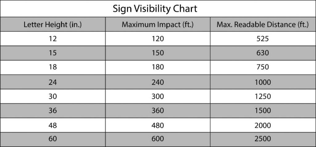
Letters that are too small or too big will have a negative impact on the quality of your sign. It’s best to know what viewing distance works best for the location you have. Letter size can often be overlooked but it’s very important when considering your sign is what needs to draw customers in. Distances may vary by up to 10% depending on color combinations (discussed later). To make this make more sense, sit approximately 3 feet away from the screen, and look at the following text:

The top text is at maximum impact distance while the bottom text is at maximum readable distance.
For any sign height at maximum impact, the font size at 3ft away from the screen is 21.6pt, and for maximum readable distance, it’s 4.94pt. How’d we figure out this example? Here the formula:
Letter height ÷ (Distance from sign ÷ Distance from screen) X 72 = Font size
It may look confusing, but we’ll break it down:
• The letter height is any number from column 1 in the chart above (make sure it’s in inches).
• Distance from sign is the corresponding number in columns 2 or 3, or whatever number you want to try (keep this in feet).
• Distance from screen is how far away you are from your screen (or paper, if printed) in a measurement of feet.
• The 72 comes from a conversion of inches to points, the most common scale for text sizes. The actual number is 71.999999, but who wants to type that?
• Do what’s in the parenthesis first, round your answer to 2 decimal places, and you’ll have the correct size to test out any font.
Font
Finding the right font for the right distance can be tricky. The font chosen can have a huge impact on sign visibility. The example above used “Helvetica”, which is a common font among channel letter signs. But what about script or special fonts? You can perform your own font test to see what your font will look like from different distances by printing it out and placing it the same distance you were looking at it on screen.

Special fonts should be used on signs where distance of visibility isn’t an issue or concern. Take a look at the text to the right. The script font “Script MT Bold” makes visibility at the max distances above more difficult to read. Making the letters larger will allow for special fonts to read easier at those same distances, but they may not fit your space requirements.
Here are some more examples:


Spacing
Spacing between letters is another important factor worth mentioning. To the right we have “L” and “W” on the top have no overlapping while the “L” and “W” on the bottom slightly overlap; this is called kerning. Kerning – changing the amount of space between two characters – may add a desirable effect to any sign, but from farther distances, may cause visibility issues.
Colors
In a different tip we wrote about colors, what they mean, and how they are perceived mentally and visually. Some color combinations may sound great, but they may make letters hard to differentiate and affect readability. Try to choose colors with high contrast based on hue and value, but try to avoid colors on opposite sides of the color wheel. White always works well with dark colors, as does black with lighter colors. Here are just a few basic examples of good color combinations:
When working with color combinations, make sure that the client’s sign won’t blend in with the color of the building or surrounding area. For example, a red face may not be the best option for a sign going on a red brick building.

Pixels Vs. Vector
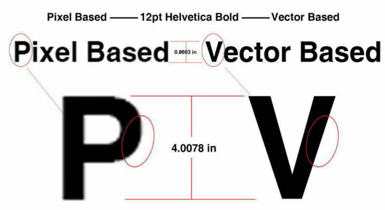
Pixel Based images or Vector Based images? It depends on the situation. Pixels are often defined as the smallest element of a picture, and each pixel has its own attributes and properties. It is a digital process that replicates a photograph so we can see the image with uninterrupted color transition.
Vector based images are defined by mathematical equations. They are similar to geometric diagrams using points and lines. Their individual objects each have their own set of attributes and characteristics. Vector-based images are a must in the Sign Industry.

The editing capabilities of vector-based images are very easy. Since vector images are based off of mathematical equations, the size of the image can be changed infinitely small or large and still retain its quality. Whereas pixel-based images, when sized up, drastically lose their quality.
Since vectors exist in a mathematical space, as opposed to a literal space that pixels exist in, zooming in on a vector image never seems to get any “closer.” The advantage to this is that vectored objects operate independent of image resolution, giving a crisp, clean look to the artwork. Here are some examples of Pixels compared to Vectors:

Vector Programs
For vector formats we use Omega, Artpath, Enroute, Logixx, Wasatch, CrelDraw, CorelPhoto, Adobe, OCR Vector, and LEDWizard to import artwork. These programs provide us the graphic ability to edit or design any file type with ease. We are most compatible with these vector graphic extensions: Adobe Illustrator .ai, Encapsulated Post Script .eps, Omega .plt, and Corel .cdr. Vector art that is not “Clean” or production ready must be cleaned and modified prior to production. (Artwork must not have any unnecessary control points and must have smooth edges to be considered “Clean”.)
If files are sent in “pixel” or picture formats such as .jpeg, .bmp, .png, etc., it then has to be cleaned up and converted to vector art which doesn’t take long but come with additional charges.

There are many factors to determine sign visibility. I hope you gained a better understanding of how visibility affects your signage and what you want as an end result. We are always here to answer any question you may have. Just give us a call at 800-544-6381 or email your sales rep!


